Skool Buddy
One University. Too Many Platforms. Nothing Connected.
Skool Buddy is an iOS app concept that consolidates courses, community, and campus resources into one unified platform. Because every student knows the chaos: one app for grades, another for schedules, WhatsApp for group chats, email for announcements, and a website that changes every academic year. Built from user interviews and validated through usability testing with real students.


The Reality

Starting university means getting a registration portal, a student portal, a Uni app, and a website for everything else. When I asked some students how they manage it all, the answer was always the same:
"You just get used to it."
But should you have to

And it keeps changing.
Every semester brings updates: new layouts, new links, new systems to learn. Students adapt by lowering expectations, Which leads to unintentional mistakes. From Reddit to real conversations, the pattern is the same.
Everyone adapts differently. No one has a real solution.
The Approach
How might I help students navigate university; without adding to the chaos?
Two goals defined the design:
Unify the experience: courses, community, and resources in one place
Reduce friction: familiar patterns, no learning curve
Listening to Students
What do students already use, and why isn't it working? I evaluated four platforms students use, rating each across seven UX factors to find where they fall short.
Competitive Analysis
User Interviews
Througha interviews with five Brighton students, I heard the same frustrations repeated: scattered tools, missed information, and the constant feeling of being lost.
I’m used to social media, but I’d prefer something that feels more campus-focused.
🙏 💭
Research Findings
Across interviews and competitive analysis, the same problems kept appearing: fragmented tools, disappearing support, These pointed to four clear requirements not just problems to solve, but principles to design around.
One Source of Truth
Everything students need: courses, deadlines, events, contacts;must live in one place. No more checking five platforms.
Support the Full Journey
The platform must be useful from acceptance to graduation, not just during orientation week, or beginning of each semester.
Balance Structure and Spontaneity
Students need space for both coursework (structured) and community (spontaneous). One platform, both modes.
Tools That Fight You
Students should complete core tasks without thinking twice. Familiar patterns from apps they already use. No learning curve, no friction.
Users in focus
The interviews revealed three distinct student types. Each navigates university differently, but all struggle with the same fragmented systems.

Aisha Patel
International Student

Emily Williams
Undergraduate Student

James Pearson
Part-Time / Masters Student
Making Sense of It All
Current Task Scenarios
How do students complete key tasks today? Before designing the solution, I mapped how each persona completes their goals using existing tools.
Scenario 1:
Connecting with Community Before Arrival
For AISHA
Scenario 2
Discovering & Attending University Events
For EMILY
Scenario 3
Joining & Engaging in a Study Group
For JAMES
Card Sorting / Information Architecture
Letting Students Define the Structure
How do students complete key tasks today? I ran card sorting sessions to understand how students naturally group information. Their mental models shaped the app's architecture.
Final Results
Home: Daily overview, quick access
School: Daily overview, quick access
Community: Daily overview, quick access
Messages: Daily overview, quick access
More: Daily overview, quick access

From Paper to Prototype
Exploring Ideas on Paper
The structure was set. Now the harder question: how should each section actually work? I
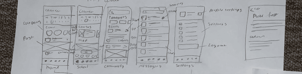
With direction set, I moved into higher fidelity—focusing on three core areas.
School
How do students find what they need (fast)?
Students check their timetable, access course resources, and track deadlines, often in a rush between classes. The School section needed to surface the most urgent information first, while keeping everything else one tap away.
Calendar
Easy access to active courses for quick switching
Courses
Easy access to active courses for quick switching
Quick links
One tap to get through anything you're looking for

Community
How do I avoid building another social media app?
A community space on an academic app can't feel like another social media feed. This needed to be purposeful browsing.

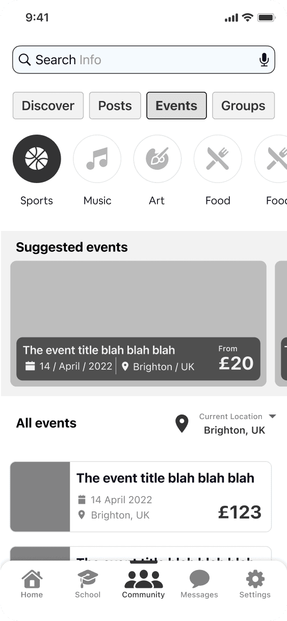

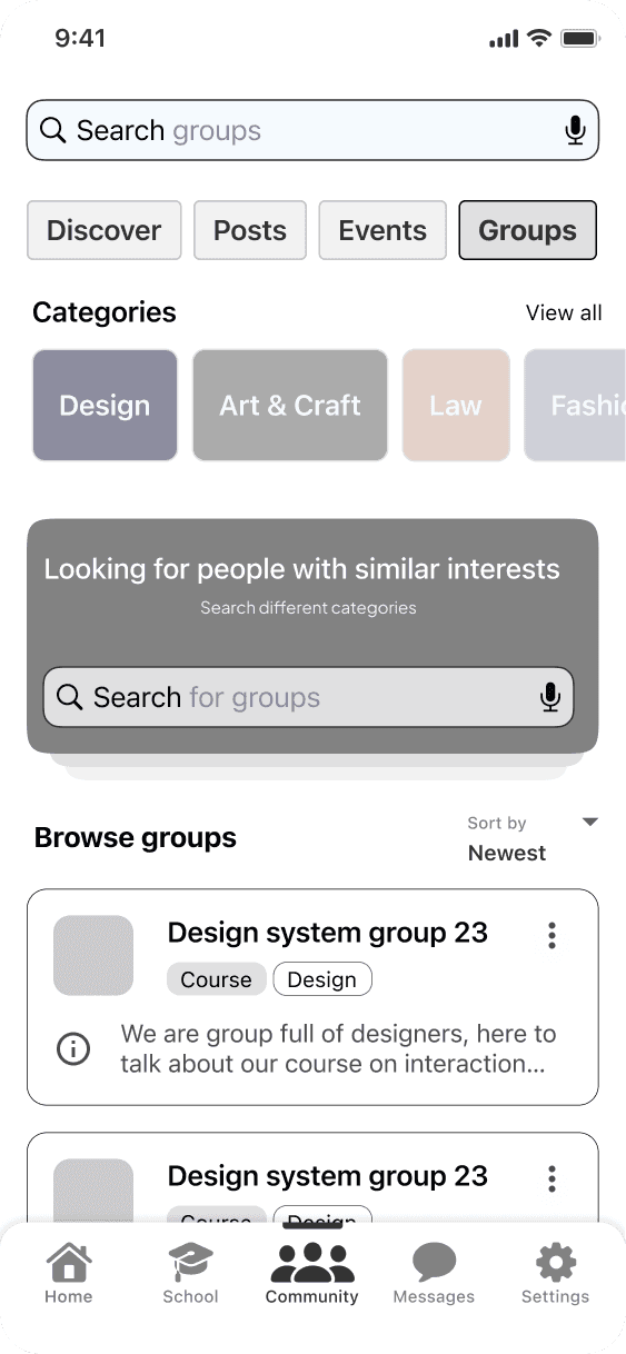
Four distinct areas, each answering a specific question: What's happening? (Discover), What are people saying? (Posts), What's coming up? (Events), Who can I connect with? (Groups).
Messages
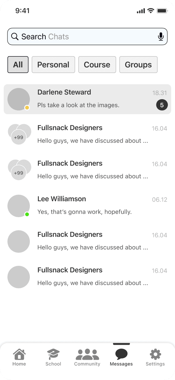
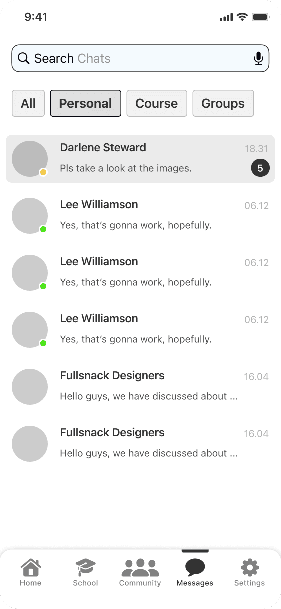
How do I make messaging feel familiar?
Students already know how messaging works. The goal wasn't to reinvent it, just to organise it better. Familiar patterns, clear categories, and quick access to the conversations that matter most.

Learning What Worked
Designs can feel right and still fail with real users. I tested with 5 students to find out if the structure, navigation, and flows actually worked, or if I'd missed something fundamental.
Results at a Glance
Task Completion
SUS Score
Avg Task Time
Severity Rating
Task & Severity
All participants completed core tasks within target time. Issues identified were cosmetic, minor refinements, not structural problems.

SUS - System Usability Scale
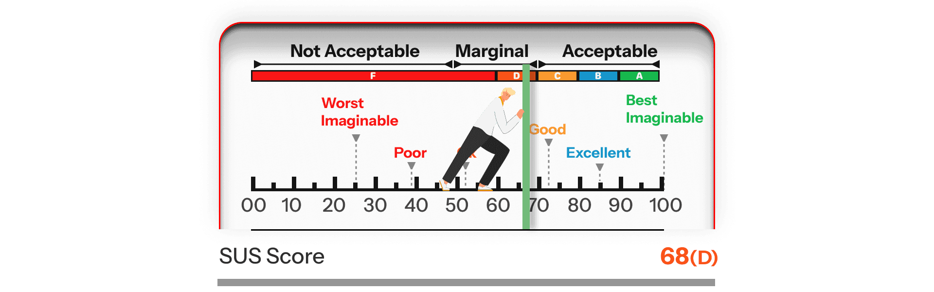
68.5 tells two stories. The structure worked, users completed tasks, understood navigation, and didn't get lost. The score reflects what wireframes can't show: visual hierarchy, colour cues, and polished interactions. The foundation is solid; the surface needs refinement.
Interviews - Some suggestions from users
Testing a wireframe means feedback focuses on what's missing, not what's working. Users suggested features and visual improvements, confirming the structure was clear enough for them to imagine what more it could do.
“It’d be awesome to have a little marketplace where students could swap books or used items.”
💡
The Final Solution
Exploring the possibilities of
Home
School
Community
Messaging
Extras
Home
Begin Here. Go Anywhere.
Start here, go anywhere. Home connects to every part of SkoolBuddy, one tap to classes, events, messages, or campus info.

Everything Academics lives here, just one tap away
School
Everything academic lives here: courses, calendar, resources, contacts, and more.
Exploring the school scetion
The most urgent information sits at the top—today's classes, upcoming deadlines. Scroll for courses, resources, and contacts. Students get what they need without digging.

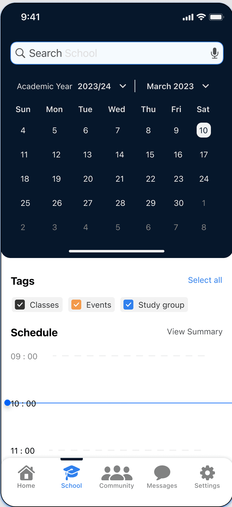
Never Miss a Deadline
Your school management system pulls from courses, events, and deadlines. with ability to manually add events and connect to other carlenders
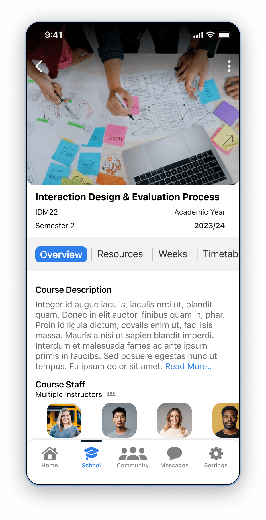
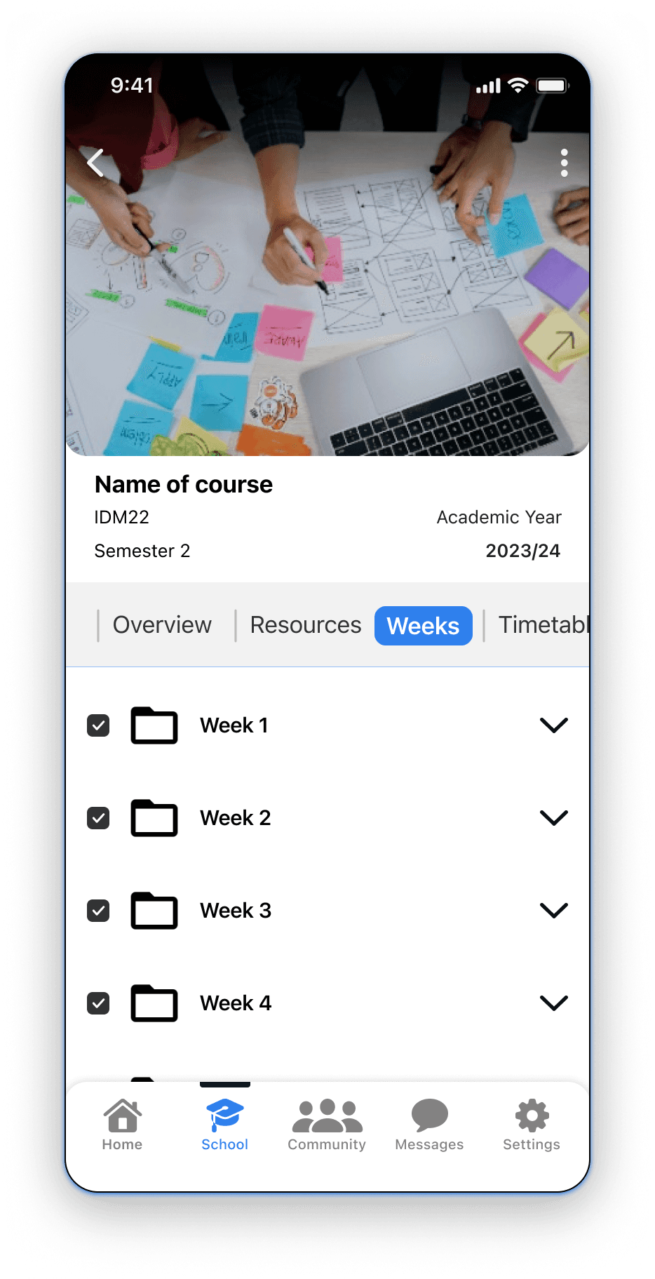
Deep Dive: Course Module
Each course contains everything students need: overview, discussions, weekly content, timetable, study groups. No jumping between platforms.


Everything Academics lives here, just one tap away
Community
A better way to connect with campus life.


Posts. Events. Groups.
Explore conversations through Posts. See what's coming up with Events. Join communities that share your interests with Groups.
Tap In. Take Action.
React and reply to posts. View event details and RSVP. Request to join groups you're interested in.


Your Personalised View
Posts, events, and groups, all in one view. Discover shows what matters based on your course, interests, and campus activity.
Where students meet, discover, and belong.
Messages
All your conversations, finally in one place.


All. Personal. School. Groups.
Every message sorted by context. Personal chats with friends. School messages from lecturers and staff. Group conversations for courses and study groups. Or see everything at once.

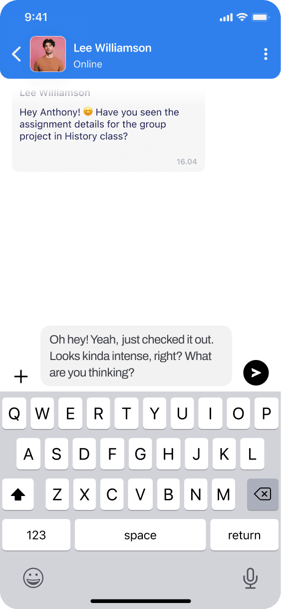


Text like you are used to
Type, reply, react, just like the apps students already know. Whether it's a personal chat or a busy group thread, messaging feels natural.
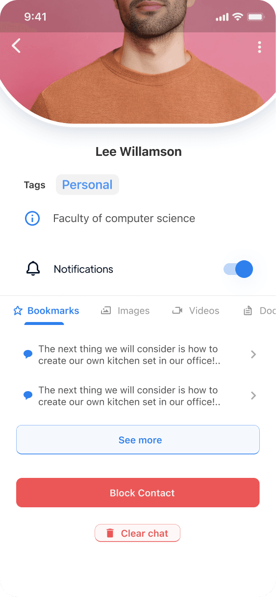
Profiles at a Glance
Tap a profile to see who you're chatting with, their course, shared groups, and how to reach them. For group chats, see all members and what the group is about.



Where students meet, discover, and belong.
Extras
Getting in, getting started, and making it yours.
Welcome
Open the app. Choose your university. Sign in. Students are inside in seconds.
The Welcome Tour
Type, reply, react, just like the apps students already know. Whether it's a personal chat or a busy group thread, messaging feels natural.
Profile & Settings
Personalise the profile. Control the app through settings. Access legal and privacy policies when needed.
This is Skoolbuddy.
University life, simplified.
Looking Back
Honestly, I expected the structure to be the hardest part. It wasn't—because I didn't design it alone. Card sorting showed me how students already think, and I built around that.
Structure came from users, not assumptions
Social features serve campus life, not endless scrolling
School and Community stay connected but never tangled
This project has blind spots. Five students isn't enough. One university isn't representative. iOS-only isn't the full experience. I worked within constraints, but constraints leave gaps.
Broader testing pool—different universities, accessibility needs
Android and web versions to see the full picture
Features like marketplace and video calling stayed on the backlog
Final Note